
5+ The pie charts below show favorite social media channels from 2011 to 2013
The pie charts below show favorite social media channels from 2011 to 2013. Summarise the information by selecting and reporting the main features, and make comparisons where relevant. Write at least 150 words hay nhất giúp bạn có thêm tài liệu tham khảo để viết bài luận bằng Tiếng Anh hay hơn.
5+ The pie charts below show favorite social media channels from 2011 to 2013
Đề bài: The pie charts below show favorite social media channels from 2011 to 2013. Summarise the information by selecting and reporting the main features, and make comparisons where relevant. Write at least 150 words
The pie charts below show favorite social media channels from 2011 to 2013 - mẫu 1
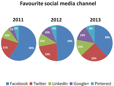
The pie charts show users’ preference on social media channels throughout the 3-year period, from 2011 until 2013. Overall, Facebook was the most favorable social media channel for three consecutive years despite a gradual fall from one year to another.
Facebook started with the largest number of 59% users in 2011, and the figure began to drop slightly by 10% in the following year. In 2013, only 38% of respondents agreed that they like Facebook better than other social media platforms. Twitter ranked just below Facebook with a huge gap in 2011, which was narrowed from year to year as the percentage of Twitter’s fans consistently increased from 21% to 25%.
A similar pattern can be seen in the rest of social media channels. LinkedIn continued to attract more people and achieved 15% enthusiasts in 2013. Google+ and Pinterest shared the same percentage in 2011 at only 5%; However, while Pinterest showed a minimal change of only 3%, the figure for Google+ nearly tripled to 14%, becoming the social media with the most significant increase among the five.
The pie charts below show favorite social media channels from 2011 to 2013 - mẫu 2
The charts depict user preferences across various social media platforms from 2011 to 2013. Throughout this period, Facebook maintained its status as the top choice, despite experiencing a gradual decline in popularity each year. Initially, in 2011, Facebook garnered the highest percentage at 59%, which decreased to 49% in 2012 and further dropped to 38% by 2013.
In contrast, Twitter consistently gained traction over the three-year span, albeit with a noticeable gap behind Facebook. Starting at 21% in 2011, Twitter’s popularity steadily rose to 25% by 2013.
Similar trends were observed with other platforms. LinkedIn witnessed a continuous increase in users, reaching 15% by 2013. Google+ and Pinterest, both starting at 5% in 2011, experienced divergent trajectories. While Pinterest’s popularity saw a slight rise to 8% by 2013, Google+ underwent a significant surge, nearly tripling to 14%, marking the most substantial growth among the platforms analyzed.
The pie charts below show favorite social media channels from 2011 to 2013 - mẫu 3
The provided pie charts compare the percentages of 5 different popular social media platforms namely Facebook, Twitter, LinkedIn, Google+ and Pinterest in three consecutive years from 2011 to 2013.
It can be seen that Facebook remained the leading social media platform; however, its user base decreased over the three-year period. Meanwhile, the platforms saw increases in their user percentages, reflecting shifting preferences among social media users
In 2011, Facebook accounted for more than half of the users, followed by Twitter with approximately one-fifth of the total. In the following years, Facebook's percentage dropped slightly by 2% before reaching 38% by the end of the period. In contrast, Twitter saw a rise in popularity, with increases of 2% and 3% in 2012 and 2013, respectively.
On the other hand, other social media platforms were significantly less popular, since all of them collectively accounted for only 20% of the total in 2011, with Linkedin users doubling that of Google+ and Pinterest supporters. However, they experienced an upward trend in the next two years following the decline of Facebook users, with Google+ having the most dramatic surge of 9% in total.
Xem thêm các bài luận Tiếng Anh hay khác:

TÀI LIỆU CLC DÀNH CHO GIÁO VIÊN VÀ PHỤ HUYNH LỚP 9
+ Bộ giáo án, bài giảng powerpoint, đề thi file word có đáp án 2025 tại https://tailieugiaovien.com.vn/
+ Hỗ trợ zalo: VietJack Official
+ Tổng đài hỗ trợ đăng ký : 084 283 45 85
Đã có app VietJack trên điện thoại, giải bài tập SGK, SBT Soạn văn, Văn mẫu, Thi online, Bài giảng....miễn phí. Tải ngay ứng dụng trên Android và iOS.


Nếu thấy hay, hãy động viên và chia sẻ nhé! Các bình luận không phù hợp với nội quy bình luận trang web sẽ bị cấm bình luận vĩnh viễn.
- Đề thi lớp 1 (các môn học)
- Đề thi lớp 2 (các môn học)
- Đề thi lớp 3 (các môn học)
- Đề thi lớp 4 (các môn học)
- Đề thi lớp 5 (các môn học)
- Đề thi lớp 6 (các môn học)
- Đề thi lớp 7 (các môn học)
- Đề thi lớp 8 (các môn học)
- Đề thi lớp 9 (các môn học)
- Đề thi lớp 10 (các môn học)
- Đề thi lớp 11 (các môn học)
- Đề thi lớp 12 (các môn học)
- Giáo án lớp 1 (các môn học)
- Giáo án lớp 2 (các môn học)
- Giáo án lớp 3 (các môn học)
- Giáo án lớp 4 (các môn học)
- Giáo án lớp 5 (các môn học)
- Giáo án lớp 6 (các môn học)
- Giáo án lớp 7 (các môn học)
- Giáo án lớp 8 (các môn học)
- Giáo án lớp 9 (các môn học)
- Giáo án lớp 10 (các môn học)
- Giáo án lớp 11 (các môn học)
- Giáo án lớp 12 (các môn học)


 Giải bài tập SGK & SBT
 Tài liệu giáo viên
 Sách
Sách
 Khóa học
 Thi online
 Hỏi đáp