
Custom Component trong Android
Triển khai các thành phần riêng trong các thành phần đã xây dựng sẵn (pre-built) và kế thừa từ lớp con bằng lớp đã được định nghĩa riêng.
Android cung cấp các widget đã xây dựng sẵn như Button, TextView, EditText, ListView, CheckBox, RadioButton, Gallery, Spinner, AutoCompleteTextView … để bạn có thể sử dụng trực tiếp trong ứng dụng Android. Nhưng có một tình huống là khi bạn không thấy hài lòng với các tính năng đang tồn tại của bất cữ widget có sẵn nào, thì Android cung cấp cho bạn các phương thức để tạo riêng cho bạn các Custom Component (Custom Component) để bạn có thể tùy chỉnh cho phù hợp với yêu cầu của bạn.
Nếu bạn chỉ cần tạo các điều chỉnh nhỏ tới widget hoặc layout đang tồn tại, thì bạn có thể sử dụng lớp con của widget hoặc layout đó và ghi đè các phương thức của chúng.
Chương này giải thích cho bạn cách tạo Custom View và sử dụng chúng trong ứng dụng theo các bước đơn giản.
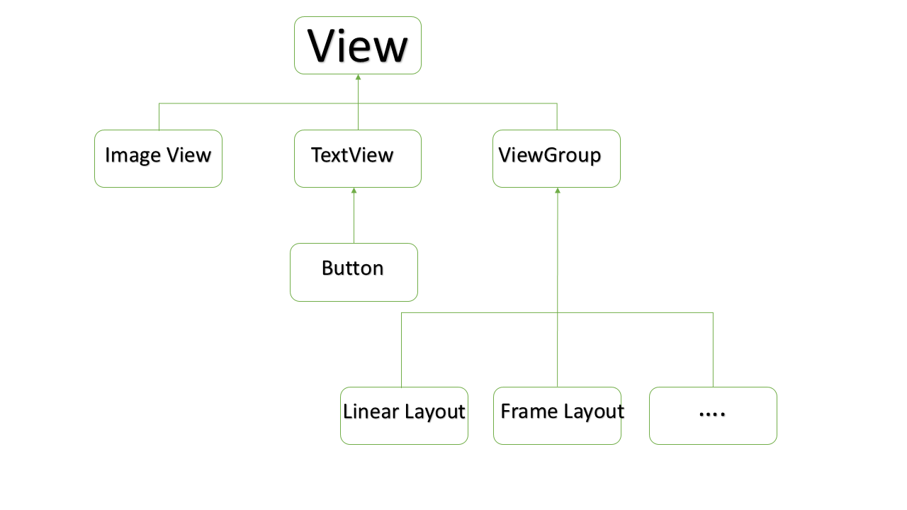
Ví dụ Custom Component trong cấu trúc Custom View
Tạo một Custom Component đơn giản
Tạo attribute file với tên attrs.xml trong thư mục res/values.
<?xml version="1.0" encoding="utf-8"?>
<resources>
   <declare-styleable name="Options">
      <attr name="titleText" format="string" localization="suggested" />
      <attr name="valueColor" format="color" />
   </declare-styleable>
</resources>
Thay đổi layout file được sử dụng bởi Activity thành như sau.
<LinearLayout xmlns:android="http://schemas.android.com/apk/res/android"
xmlns:tools="http://schemas.android.com/tools"
xmlns:custom="http://schemas.android.com/apk/res/com.vogella.android.view.compoundview"
android:layout_width="match_parent"
android:layout_height="match_parent"
android:orientation="vertical"
android:showDividers="middle"
android:divider="?android:attr/listDivider"
tools:context=".MainActivity" >
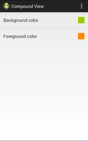
<com.vogella.android.view.compoundview.ColorOptionsView
android:id="@+id/view1"
android:layout_width="match_parent"
android:layout_height="?android:attr/listPreferredItemHeight"
android:background="?android:selectableItemBackground"
android:onClick="onClicked"
custom:titleText="Background color"
custom:valueColor="@android:color/holo_green_light"/>
<com.vogella.android.view.compoundview.ColorOptionsView
android:id="@+id/view2"
android:layout_width="match_parent"
android:layout_height="?android:attr/listPreferredItemHeight"
android:background="?android:selectableItemBackground"
android:onClick="onClicked"
custom:titleText="Foreground color"
custom:valueColor="@android:color/holo_orange_dark"/>
</LinearLayout>
Tạo java file với tên ColorOptionsView .
package com.vogella.android.customview.compoundview;

import com.vogella.android.view.compoundview.R;

import android.content.Context;
import android.content.res.TypedArray;
import android.util.AttributeSet;
import android.view.Gravity;
import android.view.LayoutInflater;
import android.view.View;
import android.widget.ImageView;
import android.widget.LinearLayout;
import android.widget.TextView;

public class ColorOptionsView extends LinearLayout {
   private View mValue;
   private ImageView mImage;

   public ColorOptionsView(Context context, AttributeSet attrs) {
      super(context, attrs);

      TypedArray a = context.obtainStyledAttributes(attrs,R.styleable.ColorOptionsView, 0, 0);
      String titleText = a.getString(R.styleable.ColorOptionsView_titleText);

      int valueColor = a.getColor(R.styleable.ColorOptionsView_valueColor,android.R.color.holo_blue_light);
      a.recycle();

      setOrientation(LinearLayout.HORIZONTAL);
      setGravity(Gravity.CENTER_VERTICAL);

      LayoutInflater inflater = (LayoutInflater) context.getSystemService(Context.LAYOUT_INFLATER_SERVICE);
      inflater.inflate(R.layout.view_color_options, this, true);
      TextView title = (TextView) getChildAt(0);
      title.setText(titleText);

      mValue = getChildAt(1);
      mValue.setBackgroundColor(valueColor);
      mImage = (ImageView) getChildAt(2);
   }

   public ColorOptionsView(Context context) {
      this(context, null);
   }

   public void setValueColor(int color) {
      mValue.setBackgroundColor(color);
   }

   public void setImageVisible(boolean visible) {
      mImage.setVisibility(visible ? View.VISIBLE : View.GONE);
   }
}
Sửa đổi Main activity và sau đó chạy ứng dụng.
package com.vogella.android.customview.compoundview;

import com.vogella.android.view.compoundview.R;

import android.app.Activity;
import android.os.Bundle;
import android.view.Menu;
import android.view.View;
import android.widget.Toast;

public class MainActivity extends Activity {
   @Override
   protected void onCreate(Bundle savedInstanceState) {
      super.onCreate(savedInstanceState);
      setContentView(R.layout.activity_main);
   }

   @Override
   public boolean onCreateOptionsMenu(Menu menu) {
      // Inflate the menu; this adds items to the action bar if it is present.
      getMenuInflater().inflate(R.menu.activity_main, menu);
      return true;
   }

   public void onClicked(View view) {
      String text = view.getId() == R.id.view1 ? "Background" : "Foreground";
      Toast.makeText(this, text, Toast.LENGTH_SHORT).show();
   }
}
Ứng dụng đang chạy sẽ trông như sau:
Thuyết minh bởi sử dụng code bên trong lớp Activity
Tương tự như cách khởi tạo Custom Component, cách mà bạn khởi tạo widget đã xây dựng sẵn trong lớp Activity của bạn. Ví dụ, bạn có thể sử dụng code sau để khởi tạo Custom Component đã được định nghĩa ở trên.
@Override
protected void onCreate(Bundle savedInstanceState) {
   super.onCreate(savedInstanceState);
   setContentView(R.layout.activity_main);

   DateView dateView = new DateView(this);
   setContentView(dateView);
}
Bạn theo dõi kỹ ví dụ trên để hiểu cách Thuyết minh một Custom Component bởi sử dụng code bên trong một Activity.
Thuyết minh bởi sử dụng Layout XML file
Theo cách truyền thống, bạn sử dụng Layout XML file để khởi tạo các widget xây dựng sẵn của bạn, và cách tương tự cũng sẽ áp dụng trên các custom widget để bạn có thể khởi tạo các Custom Component của mình bởi sử dụng Layout XML file như giải thích ở trên. Ở đây, com.example.compoundview là package mà bạn đã đặt tất cả code liên quan tới lớp DateView và DateView là một tên lớp Java mà bạn đặt toàn bộ Custom Component của mình ở trong đó.
<RelativeLayout xmlns:android="http://schemas.android.com/apk/res/android"
   xmlns:tools="http://schemas.android.com/tools"
   android:layout_width="match_parent"
   android:layout_height="match_parent"
   android:paddingBottom="@dimen/activity_vertical_margin"
   android:paddingLeft="@dimen/activity_horizontal_margin"
   android:paddingRight="@dimen/activity_horizontal_margin"
   android:paddingTop="@dimen/activity_vertical_margin"
   tools:context=".MainActivity" >

   <com.example.compoundview.DateView
      android:layout_width="match_parent"
      android:layout_height="wrap_content"
      android:textColor="#fff"
      android:textSize="40sp"
      android:background="#000"/>
</RelativeLayout>
Ở đây, điều quan trọng để ghi nhớ là chúng ta đang sử dụng tất cả thuộc tính TextView cùng với Custom Component mà không có bất cứ thay đổi nào. Tương tự, bạn có thể sử dụng tất cả sự kiện và phương thức cùng với thành phần DateView đó.
Custom Component với Custom Attribute trong Android
Chúng ta đã thấy cách chúng ta kế thừa tính năng của các widget xây dựng sẵn, nhưng trong cả hai ví dụ đã cho ở trên, chúng ta thấy rằng các Custom Component có thể sử dụng tất cả thuộc tính mặc định của lớp cha. Nhưng giả sử khi bạn muốn tạo riêng thuộc tính cho mình, thì ví dụ dưới đây là thủ tục đơn giản để tạo và sử dụng thuộc tính mới cho các Custom Component trong Android. Sau đây, chúng ta sẽ giới thiệu ba thuộc tính và sử dụng chúng như sau:
<com.example.compoundview.DateView
   android:layout_width="match_parent"
   android:layout_height="wrap_content"
   android:textColor="#fff"
   android:textSize="40sp"
   custom:delimiter="-"
   custom:fancyText="true"/>
Bước 1
Bước này cho phép chúng ta sử dụng các thuộc tính tùy biến để định nghĩa chúng trong một xml file mới dưới res/values/ và gọi nó là attrs.xml. Bạn theo dõi ví dụ về attrs.xml sau:
<?xml version="1.0" encoding="utf-8"?>
<resources>
   <declare-styleable name="DateView">
   <attr name="delimiter" format="string"/>
   <attr name="fancyText" format="boolean"/>
   </declare-styleable>
</resources>
Ở đây, name=value là những gì chúng ta muốn sử dụng trong Layout XML file như là thuộc tính, và format=type là kiểu thuộc tính.
Bước 2
Bước này sẽ đọc các thuộc tính này từ Layout XML file và thiết lập chúng cho thành phần. Trình tự logic này tiếp tục cho các Constructor mà đã được truyền một AttributeSet, khi đó là nơi chứa các thuộc tính XML. Để đọc các giá trị trong XML, đầu tiên bạn tạo một TypedArray từ AttributeSet, sau đó sử dụng nó để đọc và thiết lập các giá trị như sau:
TypedArray a = context.obtainStyledAttributes(attrs, R.styleable.DateView);

final int N = a.getIndexCount();
for (int i = 0; i < N; ++i)
{
   int attr = a.getIndex(i);
   switch (attr)
   {
      case R.styleable.DateView_delimiter:
      String delimiter = a.getString(attr);

      //...do something with delimiter...
      break;

      case R.styleable.DateView_fancyText:
      boolean fancyText = a.getBoolean(attr, false);

      //...do something with fancyText...
      break;
   }
}
a.recycle();
Bước 3
Cuối cùng, bạn có thể sử dụng các thuộc tính đã định nghĩa của mình trong Layout XML file, như sau:
<RelativeLayout xmlns:android="http://schemas.android.com/apk/res/android"
   xmlns:tools="http://schemas.android.com/tools"
   xmlns:custom="http://schemas.android.com/apk/res/com.example.compoundview"
   android:layout_width="match_parent"
   android:layout_height="match_parent"
   android:paddingBottom="@dimen/activity_vertical_margin"
   android:paddingLeft="@dimen/activity_horizontal_margin"
   android:paddingRight="@dimen/activity_horizontal_margin"
   android:paddingTop="@dimen/activity_vertical_margin"
   tools:context=".MainActivity" >

   <com.example.compoundview.DateView
      android:layout_width="match_parent"
      android:layout_height="wrap_content"
      android:textColor="#fff"
      android:textSize="40sp"
      custom:delimiter="-"
      custom:fancyText="true"/>

</RelativeLayout>
Phần quan trọng là: xmlns:custom="http://schemas.android.com/apk/res/com.example.compoundview". Ghi nhớ rằng http://schemas.android.com/apk/res/ sẽ vẫn duy trì như cũ, nhưng phần cuối cùng sẽ được thiết lập thành tên package và từ đó bạn có thể sử dụng bất cứ thứ gì đằng sau xmlns:. Trong ví dụ này, mình đã sử dụng custom, nhưng bạn có thể sử dụng bất cứ tên nào bạn thích.
Đã có app VietJack trên điện thoại, giải bài tập SGK, SBT Soạn văn, Văn mẫu, Thi online, Bài giảng....miễn phí. Tải ngay ứng dụng trên Android và iOS.


Các bạn có thể mua thêm khóa học JAVA CORE ONLINE VÀ ỨNG DỤNG cực hay, giúp các bạn vượt qua các dự án trên trường và đi thực tập Java. Khóa học có giá chỉ 300K, nhằm ưu đãi, tạo điều kiện cho sinh viên cho thể mua khóa học.
Nội dung khóa học gồm 16 chuơng và 100 video cực hay, học trực tiếp tại https://www.udemy.com/tu-tin-di-lam-voi-kien-thuc-ve-java-core-toan-tap/ Bạn nào có nhu cầu mua, inbox trực tiếp a Tuyền, cựu sinh viên Bách Khoa K53, fb: https://www.facebook.com/tuyen.vietjack
Follow facebook cá nhân Nguyễn Thanh Tuyền https://www.facebook.com/tuyen.vietjack để tiếp tục theo dõi các loạt bài mới nhất về Java,C,C++,Javascript,HTML,Python,Database,Mobile.... mới nhất của chúng tôi.
Bài học Angular phổ biến tại vietjack.com:


 Giải bài tập SGK & SBT
 Tài liệu giáo viên
 Sách
Sách
 Khóa học
 Thi online
 Hỏi đáp